iOS Booking App
Project Description

Booking App is an international Trip Agency and offers trips for users worldwide. Their target customer is too busy to prepare, select and book a trip. That is why Booking App strives to provide easy, fast quality trips for users. Their target customers are commuters and workers who find they lack the time or skills necessary to prepare a trip. They are able to offer a wide spectrum of competitive pricing, depending on options chosen by the customer.
The problem: The target customers of Booking App are typically located in metropolitan areas, and they lack the time and or skills necessary to prepare and to book a trip.
The goal: The goal was to design an app that is simple for all users – including non-native English speakers – that allows them to easily book new, exciting trips.
My role
My role in this project as a UX designer was to take ownership of the app’s design, from concept to delivery, along with the other participants from UX researches. My responsibilities included: user research, wireframing, prototyping, usability testing, iteration, and the creation of a final high-fidelity prototype.
The Design Thinking Process
I have used the design thinking process to design the Booking app.

Persona
I had to design personas to prioritize the type of users to the application. I have divided the personas into two categories. The primary personas and the secondary personas. At first, I planned to phase the product only to support the goals of the primary users. But I believe that for a long-term purpose, benefiting more than one group should be included in the strategy.
Primary Persona
George Dalman – Simple Booking
Anika Samuellson – Adventure Booking
Secondary Persona
Olaf Shah – The Casual User
Jens Schmid – The Opinion Seeker


Building the personas had helped to remind the major stakeholders always about the product, design decisions and prioritizing the feature set.
Research
I conducted interviews with target users, then distilled what I learned into actionable steps. I used the insights I have discovered to identify pain points the users were experiencing. I entered the research with a set of assumptions, but those assumptions changed as I spoke to real people who deal with the topic I were researching.
The most important pain points I uncovered were:
- They want an easy to understand user experience and user flow
- They want options to filter and compare trips
- Most users struggle to identify the trips they want, and have difficulty finding them, they wish top deals – top hotels at the beginning
- Non-native English speakers have trouble booking a trip
- The app needs to do more to engage users and get them excited about the Booking App
The information I uncovered helped me realise I needed to do more to make booking easy and engaging for busy users like George Dalman, and more usable for non-native English speakers like Anika Samuellson. Once I realised this, I had a clearer idea of how to move forward.
Based on the customer insights I gathered through the user and market research, I have used the frame of Problem Statement for the primary personas to reframe the problem and open up new design opportunities.

1. George Dalman is a busy architect who needs easy access to booking trips, because he has no time to spend too much time booking a trip.
2. Anika Samuellson is a marketing intern for a large international firm who needs an easy way to book a trip at her own pace without the pressure of booking face to face like at a booking agency and wants to see ratings, because she is a non native english speaker – needs time to translate and understand the booking options and rely on user ratings for hotels.
User Story
A fictional, one-sentence story that inspires and informs design decisions.

1. As a busy architect (names George Dalman) I want to search and filter trips online so that I can book a trip easy online.
2. As a marketing intern (names Anika Samuellson) I want to see discounts and top deals for trips so that I can book and save money.
Design Sketches

Initial Design Wireframes

Initial Design

Wireframe low fidelity: We found out that users want to filter and compare trips. In addition, users want to know special prices, discounts and top deals. They want to save top hotels and compare them.

Wireframe low fidelity: At this screen the user can search, filter and explore trips.

Wireframe low fidelity: At this screen the user can discover top hotels and top deals. UX Research showed that users are interested in last minute offers. That is why, I have added the section last minute to the wireframe.

Wireframe low fidelity: This page shows Top Hotels. Users can select Top Hotels and save them. Afterwards they can compare the saved Top Hotels (trips) at the wishlist page.

Wireframe low fidelity: This page shows the Wishlist. All saved trips are placed here.
Usability Study
Usability study
Study type: Unmoderated usability study
Location: Germany, remote
(each participant went through the usability study in their own home)
Participants: Five participants, each completing the study individually
Length: Each session was 5-10 minutes, based on a list of prompts
Results:
User had an intuitive way to book trips for a specific date and non-native speakers
had little difficulty following the process to book a trip. Users were sure of the length of the
trip and selected the date and trip and booked it.
Affinity Diagram – Turn observations into insights

Themes Identification – Booking App
1. It was observed that 4 out of 5 participants could tell me how to book a Trip. This means that for most users it is clear how to book a trip.
2. It was observed that 4 out of 5 participants would want to compare trips with each other. This means that comparing trips could be a feature which is useful for most users (wishlist).
3. It was observed that 3 out of 5 participants were confused by the filters, not knowing if a trip is related to one filter or another. This means that users were confused by trip filters.
4. It was observed that 3 out of 5 participants were confused by looking for the help button. This means that some users did not find the help button.
5. It was observed that 1 out of 5 participants were confused by looking for the profile information. This means that users did not find profile information.
Insights Identification – Booking App
1. Based on the theme that: for most users it is clear how to book a trip, an insight is: Users have an intuitive way to book trips.
2. Based on the theme that: Compare trips with each other, an insight is: Users need better cues for how to compare trips (wishlist).
3. Based on the theme that: for most users, they wish they could use filters for trips as well, an insight is: Use filter option for trips.
User Journey Map

User Flow

Interaction Design – Design Updated based on insights from usability study

Design Updated
1. User Flow were adjusted, user and non native English speaker can book easy a trip by following the new User Flow without spending much time for searching
2. Profile Information added
3. There is no time pressure while searching for a trip, users can book at their own pace
4. Search function with date, year and location included, exploration is possible
User Interface Screens
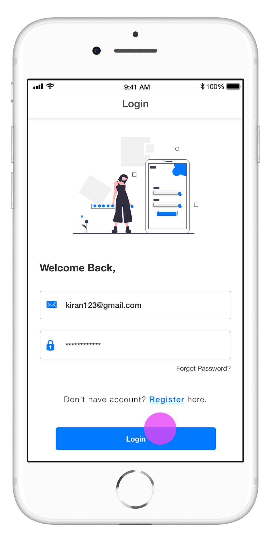
- Log In
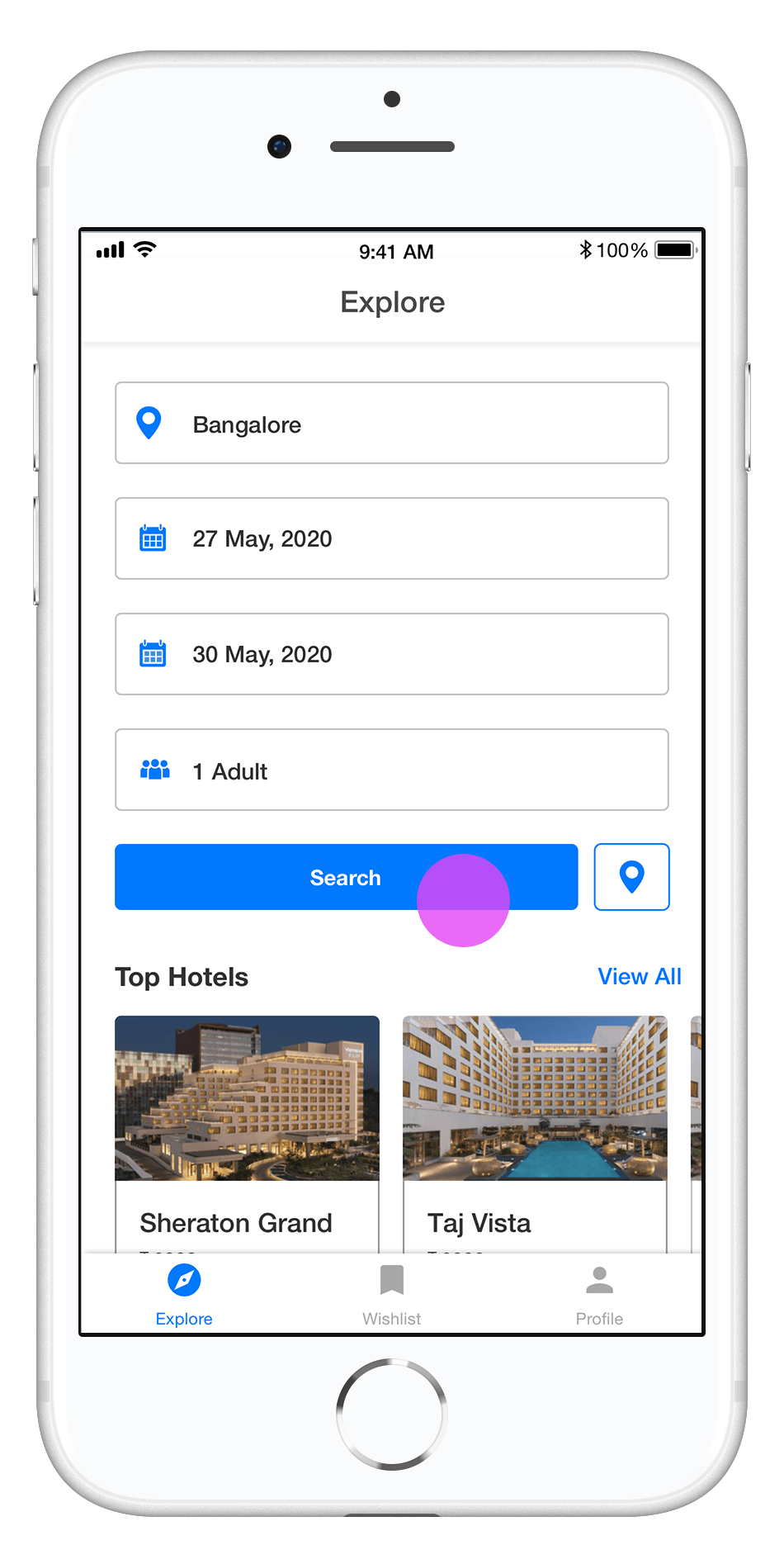
- Explore
- Profile Information

Design Updated
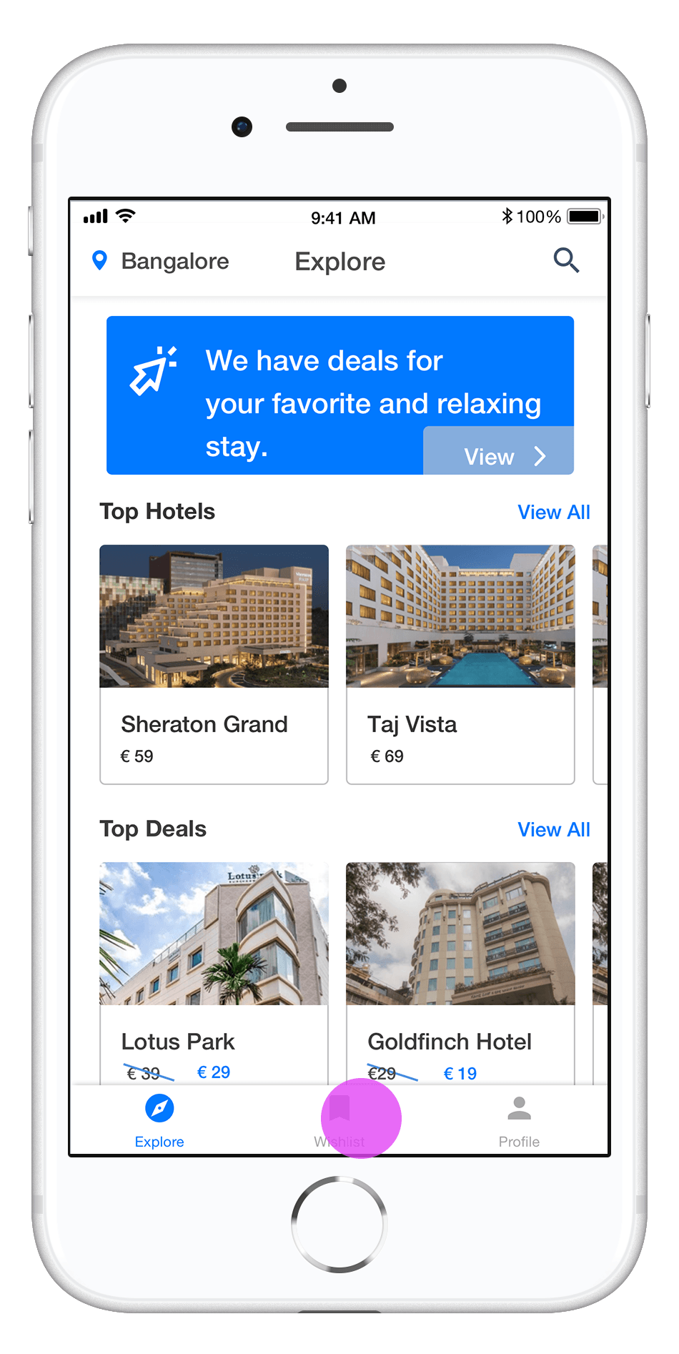
1. Top Hotels, Top Deals
2. Additional row for Last Minute offers included
User Interface Screens
- Explore
- Explore – After search (Top Hotels, Top Deals, Last Minute)

Design Updated
1. Top Hotels, discover top Hotels in Bangalore
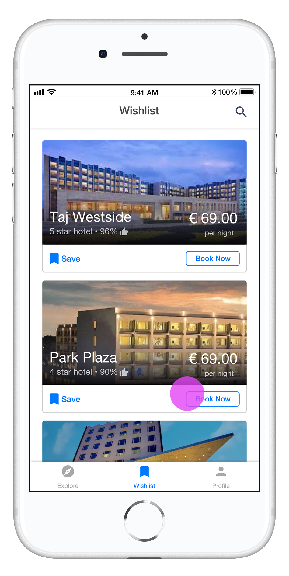
2. Save Hotel to add it to the wishlist
3. Access Wishlist, to compare hotels
User Interface Screens
- Explore – After search
- Top Hotels
- Wishlist

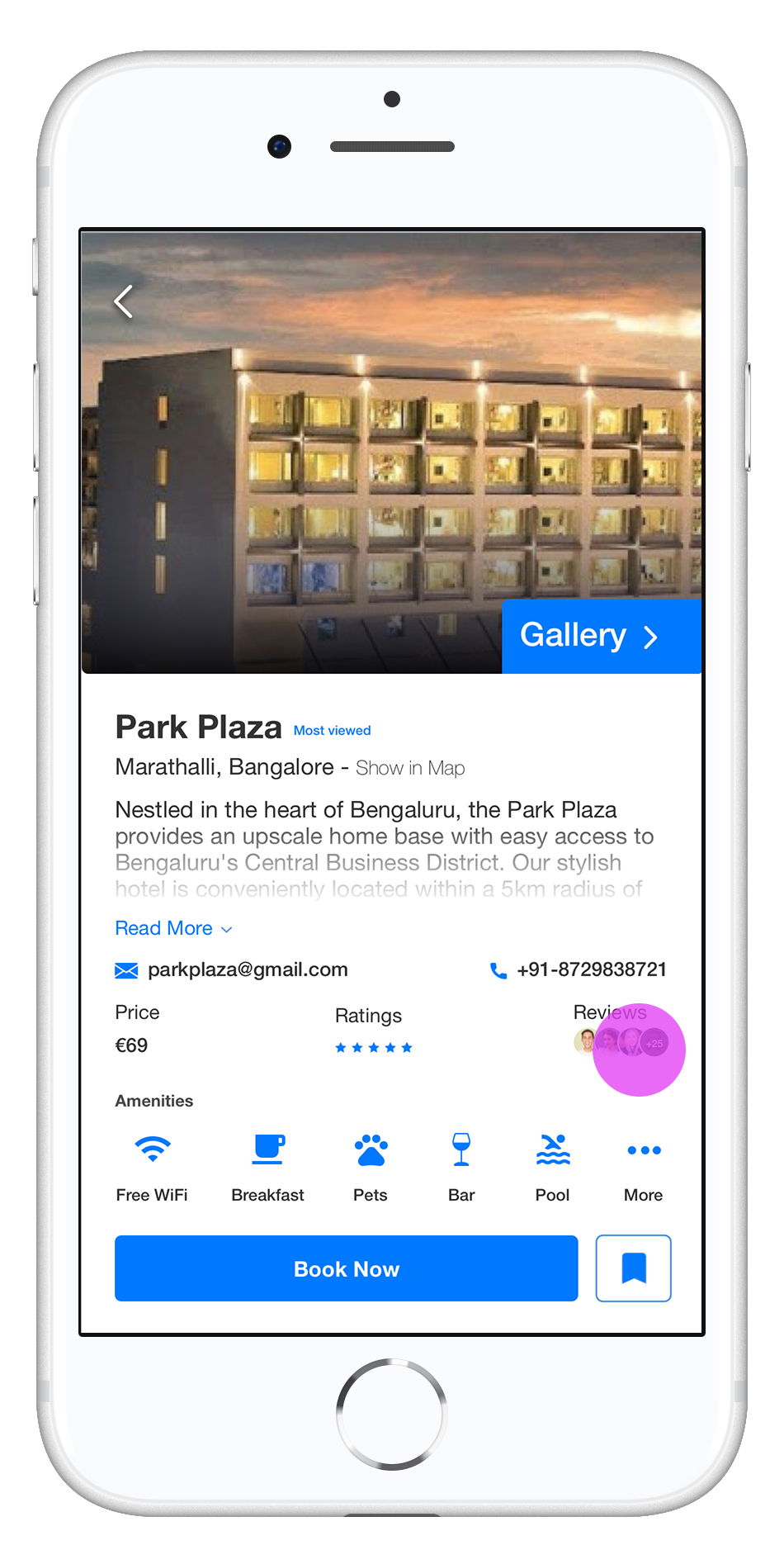
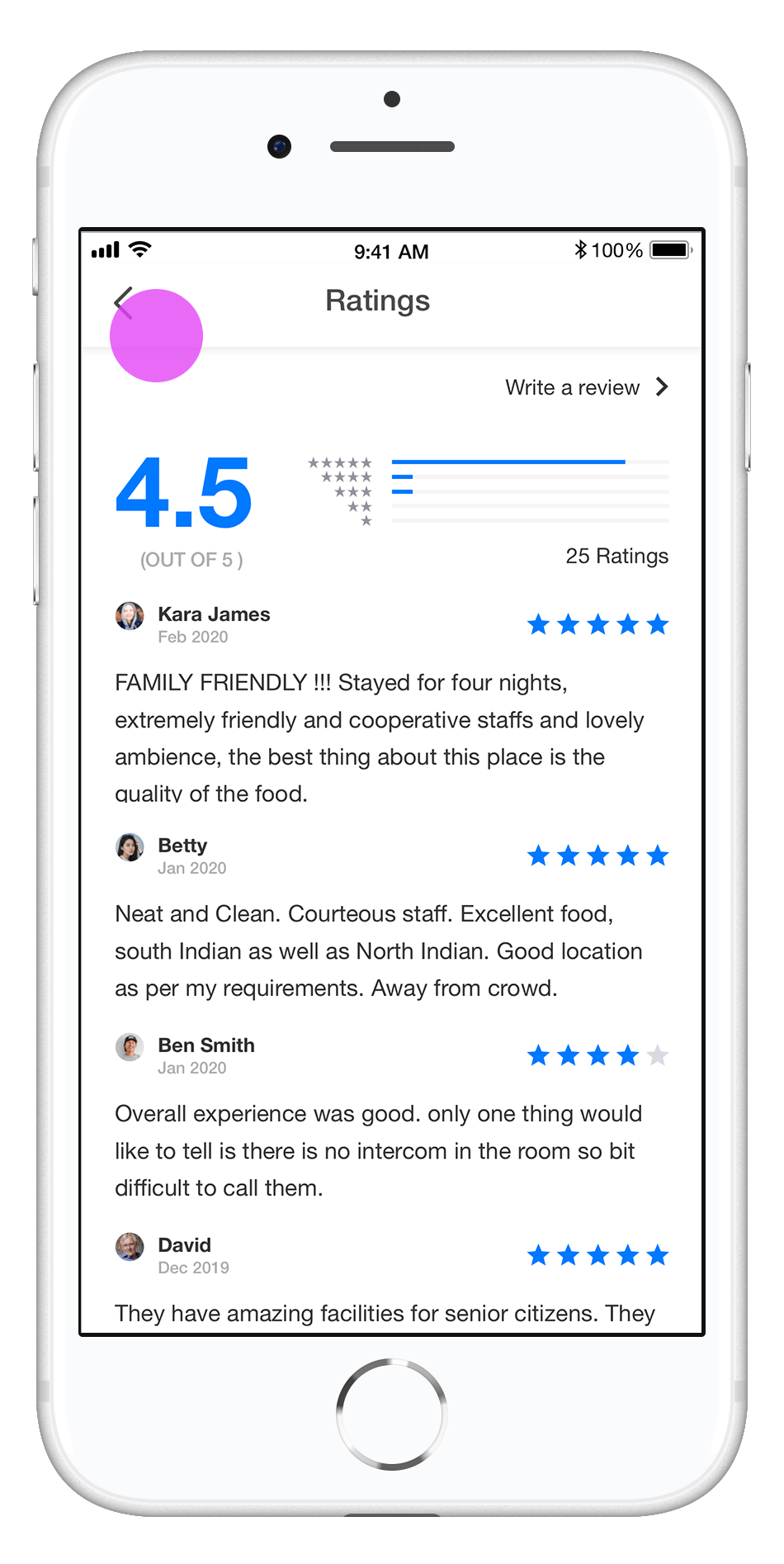
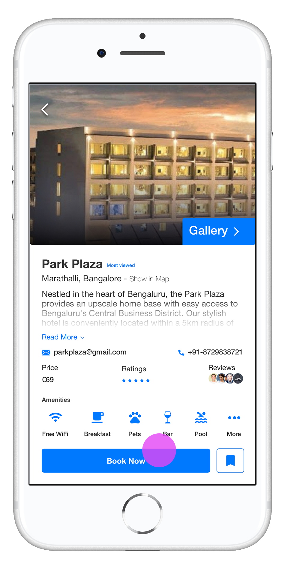
Design Updated
1. Hotel description with ratings for hotels, user can see ratings – read reviews and book hotel
2. Book Now – Call to action button
User Interface Screens
- Wishlist
- Hotel description
- Ratings for Hotel

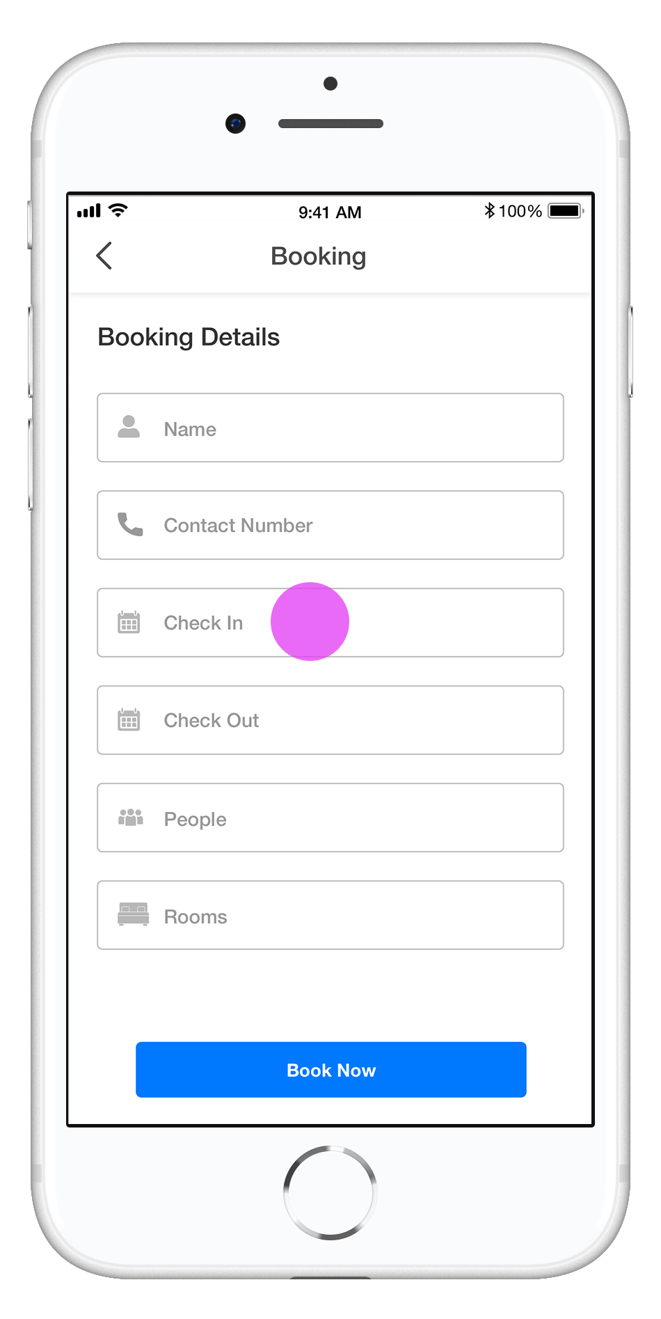
Design Updated
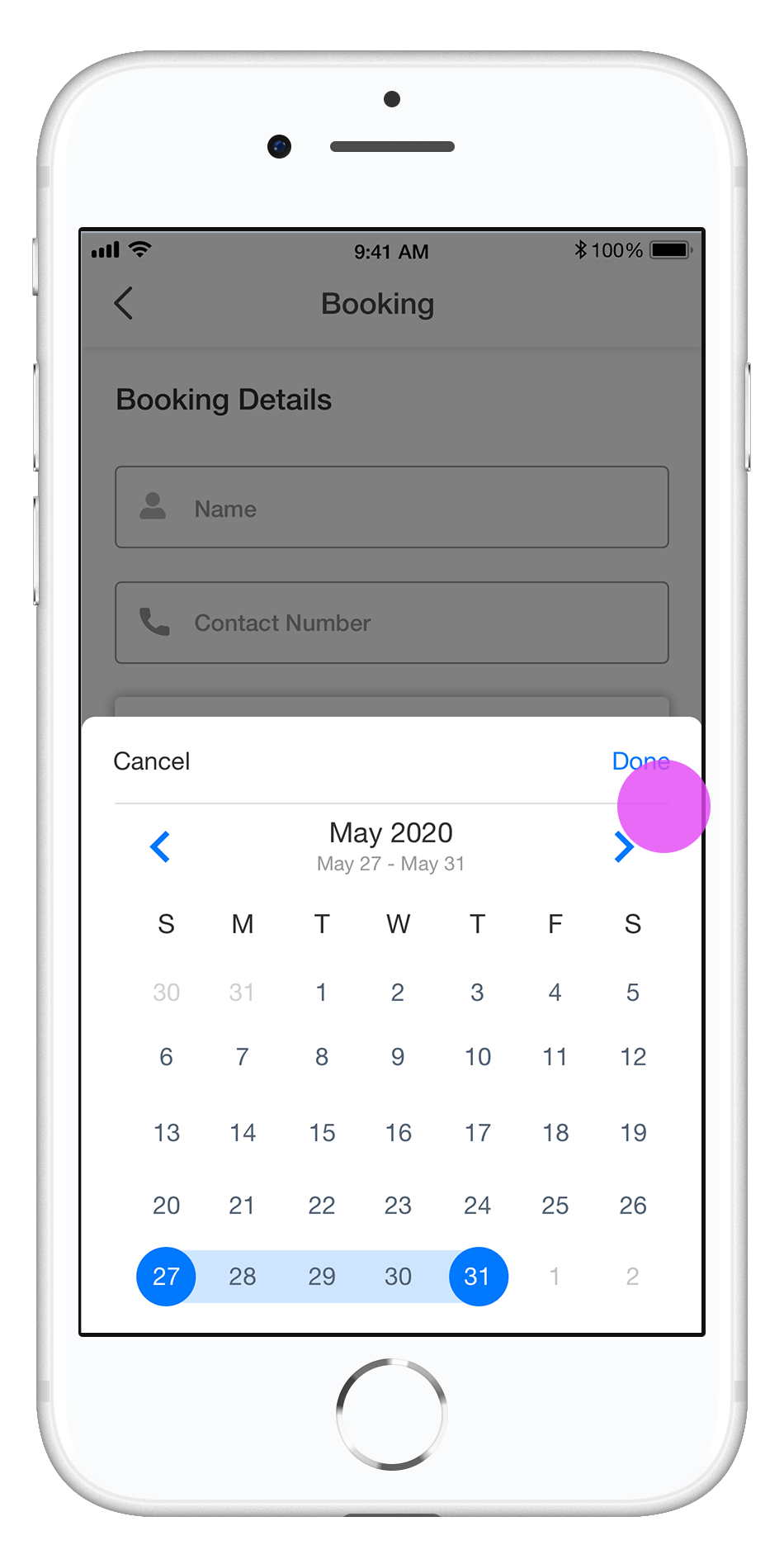
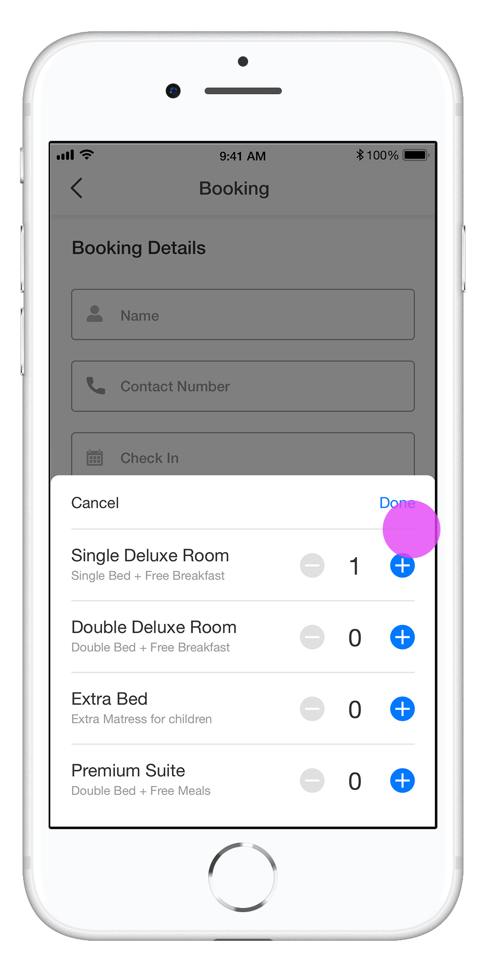
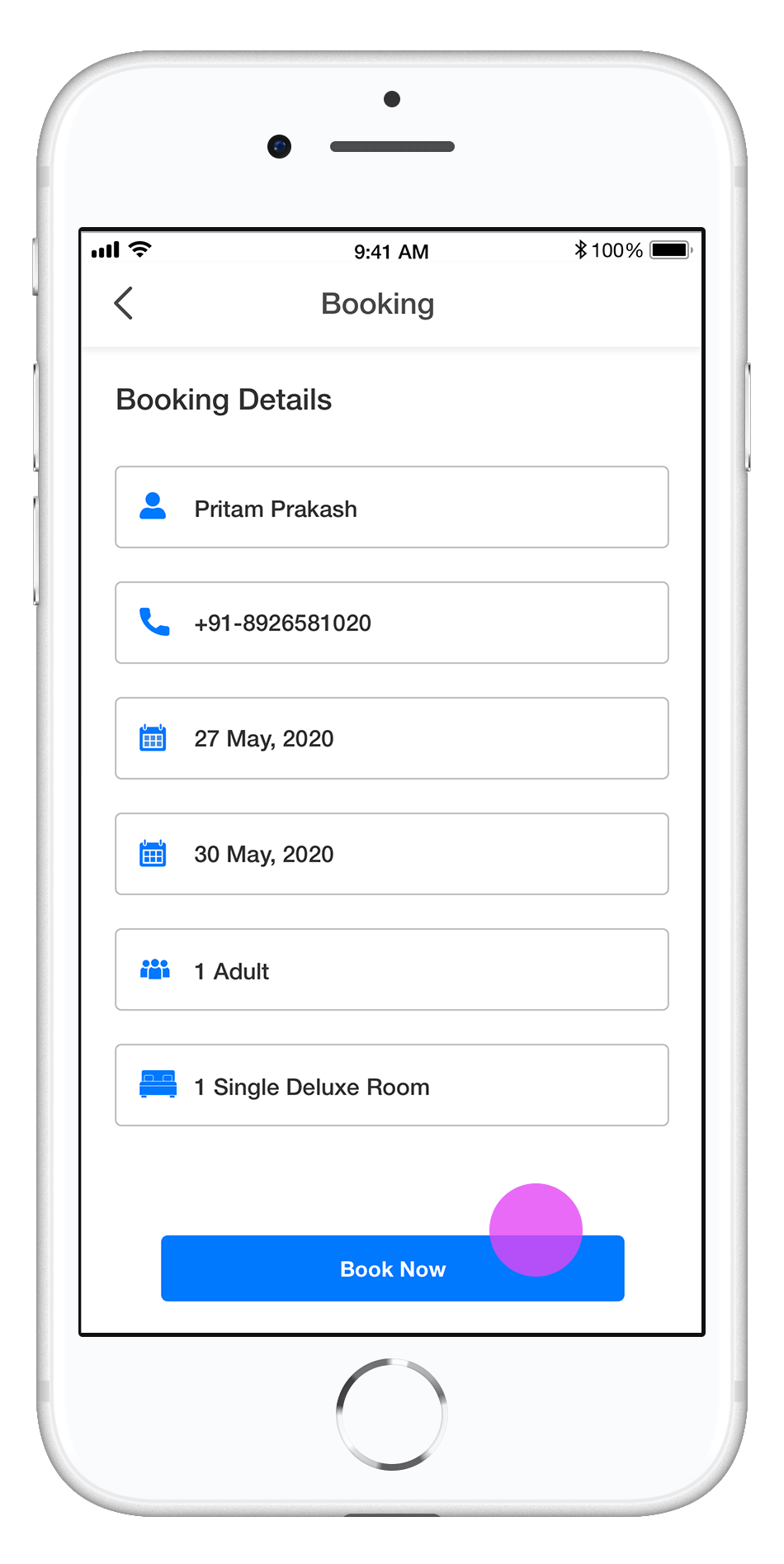
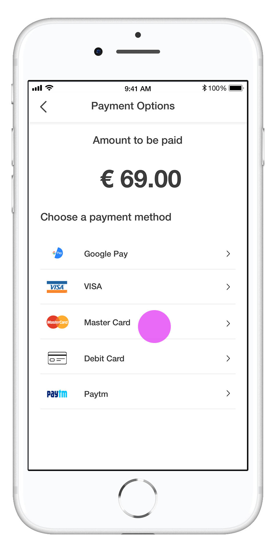
1. User can add all booking details for selected hotel
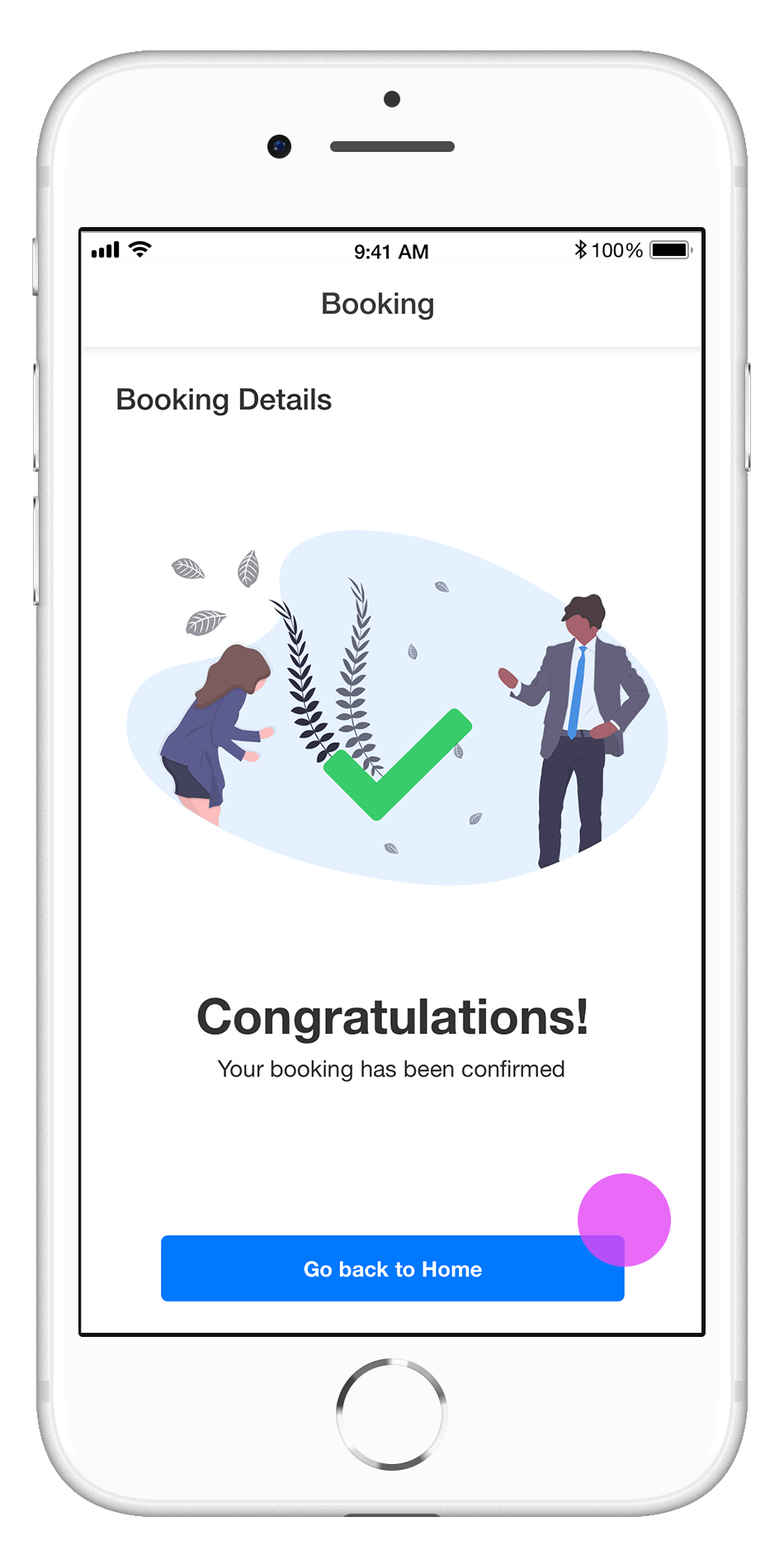
2. Confirmation Page with all settings at the end of the user flow
User Interface Screens
- Book Now
- Booking Details
- Payment Options
- Confirmation Page
Accessibility considerations
For the Booking App, the images on each page use alt text to allow a screen reader to read the content.
What I learned
While designing the Booking App, I learned that the first ideas for the app are only the beginning of the process. Usability tests and peer feedback influence each iteration of the app. As time goes on and users continue to give feedback, future improvements will surface and become more clear, and the product will continue to get better. I’m thankful to everyone who contributed to the design of this app for their support and collaboration. Moving forward, I would like to conduct another round of usability testing to validate whether the pain points my users experienced have been fully resolved. This would validate that all of the updates everyone made fully met the goals of the project.

UX Workflow

Project Description
iOS Booking App
User Experience Design / User Interface Design / Exercise
2020